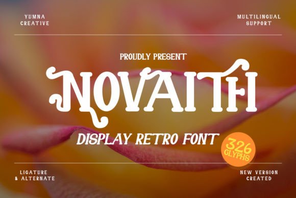
Novaith: A Retro Display Font That Pops—Without Sacrificing Clarity
Two weeks ago, I was refining the hero section of a small-batch ceramic studio’s new website—a clean, tactile brand with warm photography and hand-drawn illustrations. The client loved “vintage charm,” but not at the cost of modern usability. So when I dropped Novaith into the headline—“Hand-Thrown Since 2015”—something clicked. Not just aesthetically, but functionally. Novaith isn’t just another retro font with exaggerated curves and forced nostalgia. It’s a display font built for digital intention: bold letterforms, generous spacing, and confident contrast that holds up on both retina screens and mid-tier mobile displays.
Novaith has that unmistakable mid-century display energy—think optimistic signage, analog album covers, or boutique window lettering—but it avoids the common pitfalls of overly stylized fonts: no cramped counters, no ambiguous characters (the lowercase a and g are instantly legible), and no visual noise that competes with imagery. In practice, that meant I could safely layer it over a soft-focus background photo without adding heavy text shadows or overlays. On desktop, it commanded attention. On mobile? Still readable at 32px—even with iOS’s default text scaling turned on.
I tested Novaith across several key layout zones:
- Hero headlines: Perfect fit—especially with short, evocative phrases like “New Glazes Live Now” or “Spring Workshop Series.” Its weight anchors the top of the viewport without feeling aggressive.
- Section dividers: Used at 28px in all-caps for “Our Process,” “Studio Hours,” and “Join the Mailing List”—adding rhythm without demanding full attention.
- CTA buttons: With caution. At 18px on a solid-color button, it worked beautifully for primary actions (“Reserve Your Spot”) but felt tight on secondary buttons or icon + text combos. Best reserved for standalone, high-impact CTAs.
- Blog post headers: Paired with a neutral sans serif body (Inter, set at 16px/1.5 line height), Novaith gave editorial warmth to feature titles—without undermining scannability.
What surprised me most was how well Novaith supported brand consistency—not through repetition, but through intentional contrast. Because it’s strictly a display font (no regular or light weights included), it naturally pushes you toward smart pairing. I used it exclusively for moments that needed personality: logo lockups, campaign banners, course module titles, and social media cover graphics exported from Figma. For everything else—navigation, product descriptions, email footers—I leaned into a highly legible, variable sans serif. That separation kept the site feeling curated, not chaotic.
Readability checks were non-negotiable. I ran quick tests across devices and contexts:
- Dark mode: Novaith’s strong stroke contrast shines against charcoal or deep navy backgrounds—no fill adjustments needed.
- Image overlays: At 4% opacity white text on a busy photo didn’t cut it, but 12% opacity + subtle text stroke (1px, same color as background) preserved its character while ensuring clarity.
- Small screens: Below 320px width, I swapped to a fallback heading font via CSS
@supports—not because Novaith failed, but because hierarchy matters more than novelty on thumb-scrolling journeys. - Loading behavior: As a webfont, Novaith loaded cleanly via self-hosted WOFF2. No FOIT or FOUT drama—just a smooth, fast swap thanks to its modest file size (~48KB).
Font pairing wasn’t theoretical—it was practical problem-solving. Novaith’s personality leans friendly and grounded, so I avoided overly geometric or cold sans serifs (looking at you, Helvetica Neue). Instead, Inter, Manrope, and even the gentle warmth of IBM Plex Sans created balanced, accessible contrast. For a more editorial feel—say, on a writer’s portfolio—I paired it with a crisp, low-contrast serif like Literata or Crimson Text. Never tried it with script or handwritten fonts; Novaith’s voice is strong enough to stand alone, and mixing too many expressive typefaces diluted the message.
Licensing was straightforward—Novaith is a commercial font with clear web use terms, including unlimited domains and SaaS embedding. No hidden clauses about pageviews or active users. I also checked what was included: one display weight (Bold), full Latin character set, standard punctuation, and basic OpenType features—no stylistic alternates or multilingual extensions, which was fine for this project’s scope. If you’re building for global audiences or need extended language support, verify coverage early.
In real-world use, Novaith works best when treated like a design accent—not the foundation. It’s not for body copy, form labels, or navigation menus. But for a boutique online store’s seasonal banner, a coach’s landing page headline, a course sales page subhead (“Learn the Craft, Not Just the Click”), or a portfolio site’s project title—it adds instant character with zero usability trade-offs.
It reminded me that great typography isn’t about trend-chasing. It’s about choosing a typeface that aligns with your brand’s tone *and* your users’ needs—and Novaith does both. It feels human, intentional, and digitally sound—not like a relic borrowed from a vintage archive, but like a thoughtful tool made for today’s web.